Not bad. You have the right idea in terms of perspective, but it's a little ''too'' iso for the sprite. I also like the colors you chose, but the red is also a little too 'red' in my opinion. Your metal needs work, but it's certainly coming along.
I made my own version with this as a reference. Maybe it'll give you a better idea on how to do capes properly and how important muted colors are. The shoulderpads need a little work on mine.
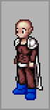
Very nice attempt though. Work a little more on your metal.
I'm only here for the food.


