It's a good concept, but there's a lot of things here that need to be touched on and fixed.
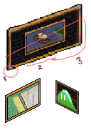
Here's a diagram to help explain.

First thing's first, where I've circled and labeled it as one & two. You can see that your lines aren't clean, like at all. This shouldn't be present in pixel art. There's a fair bit of distortion (Or probably wrongly placed anti-aliasing) around the edges which makes me believe that you just took one of the frames from the gfx files and just stretched it out to be the size you needed it to be on a program like Photoshop, which is a
huge no no. Outlining pixels are also of different sizes, which also isn't a good thing. This can be fixed with careful attention to the outline itself with the pencil tool.
Two, along with three can also be used to show you that none of those wall mounts are isometric at all. I've put an isometric line along your painting as an example, feel free to use it as a guideline if you decide to redo these.
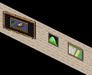
Mapping objects, especially those made to work with walls, desperately need to be isometric and aligned with walls. The importance of this can be explained by this diagram:

As you can see here, your wall mounts are also a little bit too big. The smaller paintings should also be used as size guidelines, since each wall mount is a little too big for a wall tile, unless you intended on slicing them. Size is an interesting thing when it comes to mapping objects, since there's no real guideline to it. It's best to use a similarly sized object as a reference when it comes to this.
Anyhow, those are the main things. There's a few other things, but you're welcome to come talk to me in game about it :)
Best of luck with your future pixelling endeavours.
Lettuce be pals.